Porsche crest was born in 1952
In 1948, Porsche had only the word "PORSCHE" in simple lettering, and the Porsche 356 No.1 Roadster had no crest and only the word PORSCHE.
This PORSCHE letter is made of aluminum, and it seems that an apprentice level person cut out each letter one by one with an electric jigsaw.
In 1951, Mr. Ottomar Domnick, who was professed to be a Porsche fan, took the initiative and held a contest to create a Porsche logo called "Porsche Prize".
Unfortunately, none of the works submitted to this contest met the requirements, so none of the logos were adopted.
After that, at the end of 1951, Mr. Ferry Porsche revived the story of "Let's make a Porsche logo" at a business dinner with Mr. Max Hoffman, an American importer in New York.
I previously wrote about the history of Crest here, so please refer to it if you don't mind ^ ^:History and origin of Porsche Crest
Ferry Porsche's notebook dated December 27 of this year states that "the rim of the steering wheel is decorated with the letters of Porsche and the coat of arms of Stuttgart, or something similar." that's right.
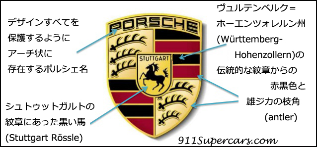
In 1952, designer Franz Xaver Reimspieß, a talented draftsman, finally created a design with a horse in a golden shield, taken from the coat of arms of the city of Stuttgart.
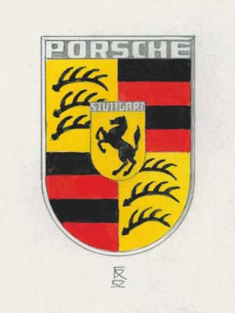
The red and black crest and the stag's antlers are a design reference to the traditional coat of arms of the state of Württemberg-Hohenzollern.
The finished Porsche crest design, which Porsche calls a complex work of art, was not only attached to the car, but also used in printed materials and other things related to Porsche, making it very impressive.
Those who oppose Porsche's crest design
…But this did not settle the matter, and in fact, it seems that there was a controversy even after this crest was adopted.
The reason for the controversy is that in the 1950s color printing was still very complicated and expensive, and not all printers had suitable presses.
It is not easy to set registration marks accurately when printing, and it is also difficult to create delicate and sharp images. On the other hand, the crest printed in black and white lacks elegance and is unremarkable.
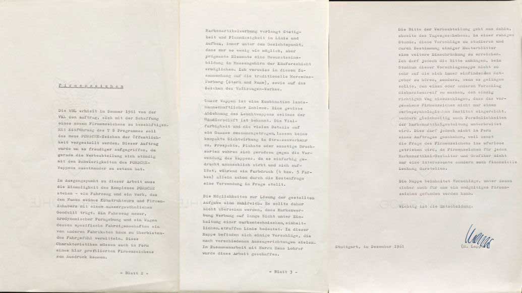
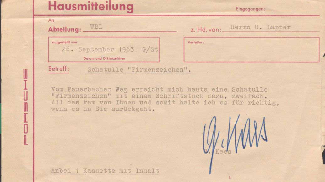
In 1961 Porsche's sales managers and dealers at that time filed a petition with Mr. Hermann Lapper, the head of the Porsche and advertising department.
The content was a negative opinion against Crest, saying, ``Different colors and many details do not create a compact and unified visual effect.''
In other words, I think there were many opinions that it was confusing and that various colors were used, making it difficult to understand.
By the way, it seems that the Mercedes and VW logos (by the way, these were also designed by Reimspieß) were given as examples of good design at this time. Certainly, various colors are not used and it is simple.
Porsche's new logo proposal
After this, in collaboration with Mr. Hanns Lohrer (a commercial designer who was in charge of Porsche posters and advertisements in the 50s and 60s), several new logo ideas were actually created to replace the current crest. So here are the designs
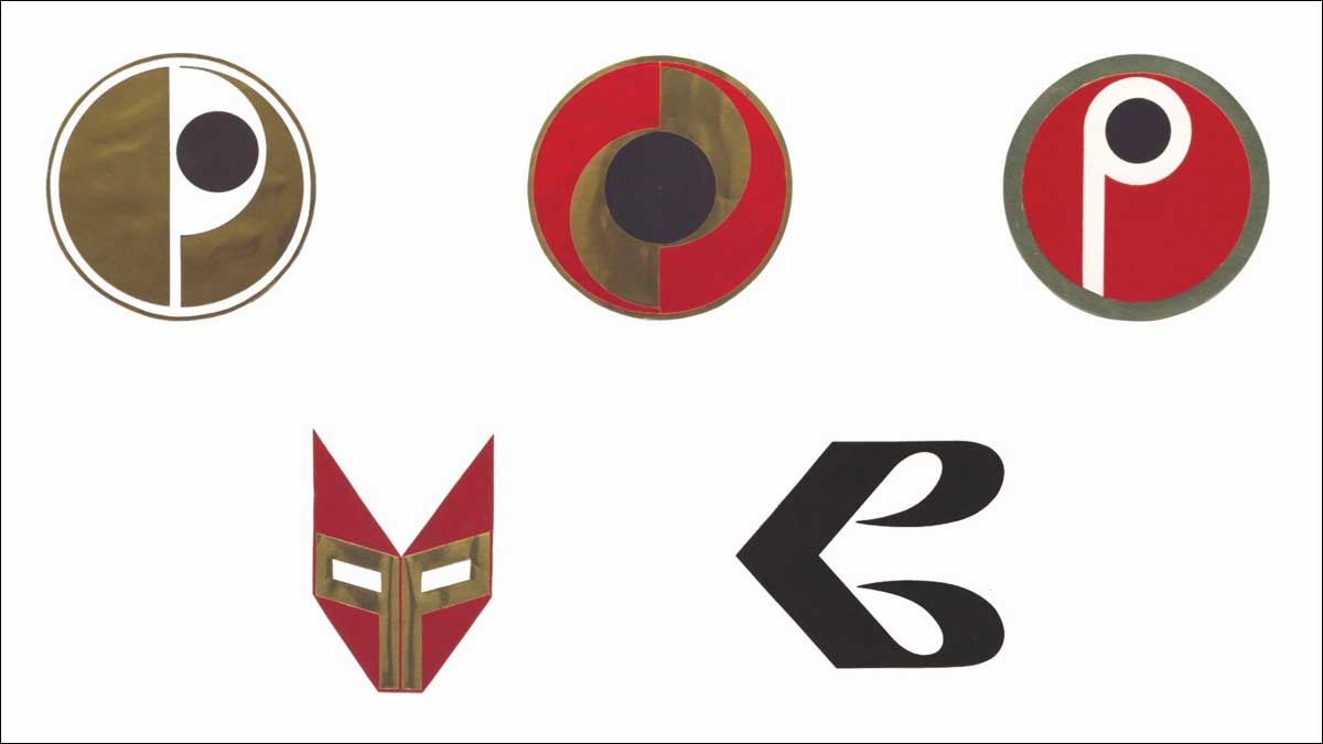
It seems that the newly designed Porsche logo was originally scheduled to be released with the "T8 program", the successor to the Porsche 356, but in fact there was no change in the crest.
The reason is probably that Porsche's crest, which has been used since 1952, has already been established, so it was decided that it was not a good idea to suddenly change the logo.
The reason why the new proposal was not adopted is not clear because there is no record in Porsche's internal archives even that there was talk of this logo change proposal.
I found out that there was such an exchange because there was a communication record of Mr. Ghislain Kaes, who was a secretary and chronicler at Porsche. It ended without anyone even knowing that the story was out.
Did someone try to get rid of this story so that none of it remained in the internal archives? ! Oh my God.
Even so, the new Porsche logo proposal, after all, I'm already familiar with the Porsche crest, so I don't feel like a Porsche no matter what I look at.
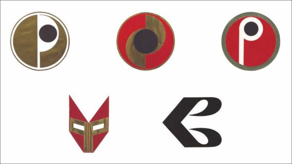
↑ The logo on the bottom left is a design that seems to have predicted that Transformers will collaborate with Porsche in 2023 ^ ^
Here is the Porsche x Transformer collaboration cap (the red one in the center is the Transformer mark)↓
Anyway, Porsche's crest is the design of the current crest, so I felt like Porsche, and I thought it was good that I didn't change to a transformer on the way ^ ^
Source:(Official) Alternative designs: how the Porsche Crest could have looked
Related article:
◆History and origin of Porsche Crest
◆Porsche to change crest design: Applies to cars from the end of 2023
◆Porsche 911 Carrera T: Replaced with silver crest, black stone guard installed
◆There is a rule in the direction of the crest mark on the Porsche wheel center cap
◆Porsche April Fool's Day: Taycan's new Porsche Crest

I'm Rika, the author of this article. Since I got my hands on a Porsche 911, I've been completely hooked on Porsches and I can't stop loving them, so I started this blog. My favorite cars are the 911 Carrera (2/991), 911 Carrera Cabriolet & 911 Carrera T (1/992), GT3 (1/997) and 718 Cayman GT4 RS.