American tire maker Firestone
In the United States, there is a store called "Firestone" that mainly deals with tires (I think). A big chain store where you don't know how many stores there are in the United States alone.

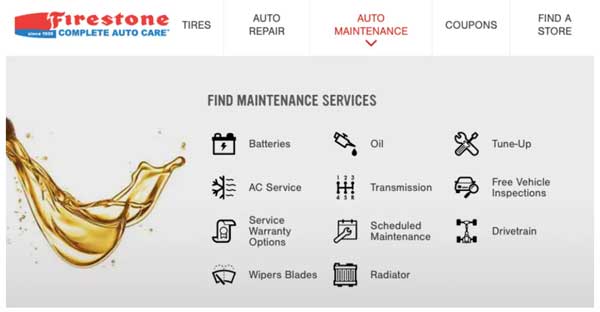
If you go to this homepage, you will find a tire center and another site called Complete Auto Care, which is a department that undertakes maintenance and repairs for all automobiles.
This time, the image that was used in this "Firestone: Complete Auto Care" was a hot topic.
ha ha ha
This certainly made me laugh when I saw it. This is ↓

understood?
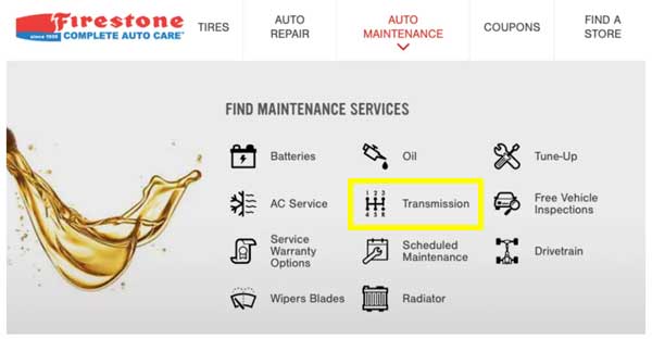
Since it is written in the title, you may have figured out what to look for immediately, but this yellow boxed "Transmission".

At first glance, I only think, "Oh, it's a shift pattern diagram. It's a transmission category." But if you look closely, the pattern looks like this.
If you don't drive a manual transmission, you may not know what's wrong (?), But if you drive it, you might think, "Wow, this seems a little difficult to drive" (laughs).

This time, it was a company that handles car products called Firestone that adopted this design picture, so it was "This is not it!".
Maybe the designer who made this icon has never driven a manual car, isn't it?
If you don't know, the numbers will be arranged neatly. yes.
So I don't know how many days after this became a hot topic, but as of today the icons have already been swapped.

This is this ↓ Yeah, this one looks better ^^

The person who noticed it, I think he noticed it well. I'm sure I felt something strange the moment I saw it.
By the way, with the old International Harvester KB track, the actual shift pattern is:
1 2 5
R 3 4
It seems that it was a strange arrangement.
Source:
◆Firestone's Web Designers Don't Seem To Have Ever Driven A Manual Transmission
◆(Official) Firestone official website

